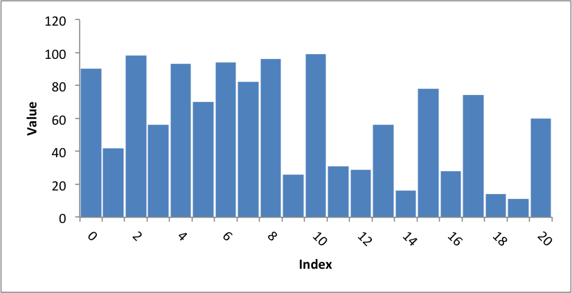
Example: Column Chart with rotated numbers
This program is an example of creating a column chart with axis labels and rotated numbers:
##############################################################################
#
# An example of creating a chart with Pandas and XlsxWriter.
#
# Copyright 2013, John McNamara, jmcnamara@cpan.org
#

import random
import pandas as pd

# Some sample data to plot.
cat_1 = ['y1', 'y2', 'y3', 'y4']
index_1 = range(0, 21, 1)
multi_iter1 = {'index': index_1}
for cat in cat_1:
    multi_iter1[cat] = [random.randint(10, 100) for x in index_1]

# Create a Pandas dataframe from the data.
index_2 = multi_iter1.pop('index')
df = pd.DataFrame(multi_iter1, index=index_2)
df = df.reindex(columns=sorted(df.columns))

# Create a Pandas Excel writer using XlsxWriter as the engine.
excel_file = 'axis_labels_rotated.xlsx'
sheet_name = 'Sheet1'

writer = pd.ExcelWriter(excel_file, engine='xlsxwriter')
df.to_excel(writer, sheet_name=sheet_name)

# Access the XlsxWriter workbook and worksheet objects from the dataframe.
workbook = writer.book
worksheet = writer.sheets[sheet_name]

# Create a chart object.
chart = workbook.add_chart({'type': 'column'})

# Configure the series of the chart from the dataframe data.
chart.add_series({
    'categories': ['Sheet1', 1, 0, 21, 0],
    'values':     ['Sheet1', 1, 1, 21, 1],
    'gap':        10,
})

# Configure the chart axes.
chart.set_x_axis({'name': 'Index', 'num_font':  {'rotation': 45}})
chart.set_y_axis({'name': 'Value', 'major_gridlines': {'visible': False}})

# Turn off chart legend. It is on by default in Excel.
chart.set_legend({'position': 'none'})

# Insert the chart into the worksheet.
worksheet.insert_chart('G2', chart)

# Close the Pandas Excel writer and output the Excel file.
writer.save()