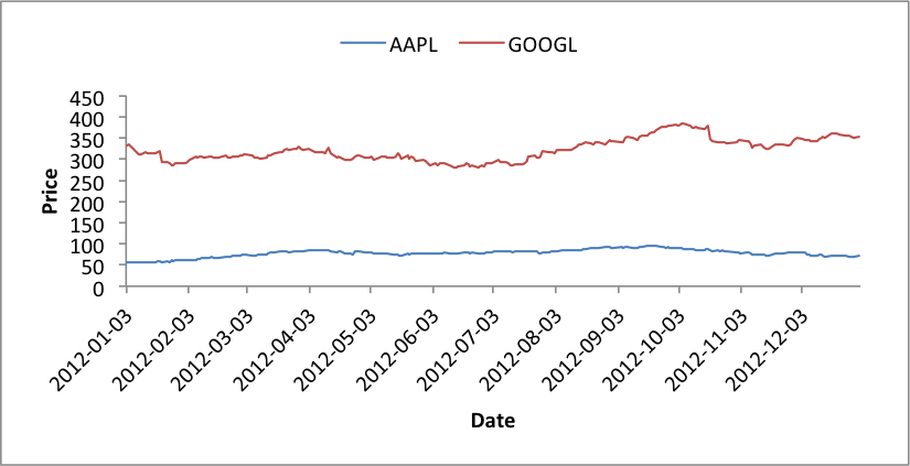
Example: Chart with Legend on Top
This program is an example of creating a line chart using stock data and with a legend on the top of the chart:
##############################################################################
#
# An example of creating a chart with Pandas and XlsxWriter.
#
# Copyright 2013, John McNamara, jmcnamara@cpan.org
#

import pandas as pd
import pandas.io.data as web

# Some sample data to plot.
all_data = {}
for ticker in ['AAPL', 'GOOGL', 'IBM', 'YHOO', 'MSFT']:
    all_data[ticker] = web.get_data_yahoo(ticker, '1/1/2012', '1/1/2013')

# Create a Pandas dataframe from the data.
df = pd.DataFrame({tic: data['Adj Close']
                   for tic, data in all_data.items()})

# Create a Pandas Excel writer using XlsxWriter as the engine.
excel_file = 'legend_stock.xlsx'
sheet_name = 'Sheet1'

writer = pd.ExcelWriter(excel_file, engine='xlsxwriter')
df.to_excel(writer, sheet_name=sheet_name)

# Access the XlsxWriter workbook and worksheet objects from the dataframe.
workbook = writer.book
worksheet = writer.sheets[sheet_name]

# Adjust the width of the first column to make the date values clearer.
worksheet.set_column('A:A', 20)

# Create a chart object.
chart = workbook.add_chart({'type': 'line'})

# Configure the series of the chart from the dataframe data.
max_row = len(df) + 1
for i in range(len(['AAPL', 'GOOGL'])):
    col = i + 1
    chart.add_series({
        'name':       ['Sheet1', 0, col],
        'categories': ['Sheet1', 2, 0, max_row, 0],
        'values':     ['Sheet1', 2, col, max_row, col],
        'line':       {'width': 1.00},
    })

# Configure the chart axes.
chart.set_x_axis({'name': 'Date', 'date_axis': True})
chart.set_y_axis({'name': 'Price', 'major_gridlines': {'visible': False}})

# Position the legend at the top of the chart.
chart.set_legend({'position': 'top'})

# Insert the chart into the worksheet.
worksheet.insert_chart('H2', chart)

# Close the Pandas Excel writer and output the Excel file.
writer.save()